
The Story behind the Cover Art for Letters from Cuba
Ruth Behar interviews John Parra
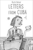 As an author, it is always exciting to see how an artist evokes the heart of your story in one single compelling image for the book cover. I was thrilled when my editor, Nancy Paulsen, sent me the beautiful art that John Parra created for the cover of Letters from Cuba. She and I, and everyone on the team at Penguin Random House, felt that the art conveyed stunningly the spirit of hope that my character, Esther, a Jewish-Polish refugee, finds in Cuba on the eve of WWII.
How did John produce the art? I was curious to learn how the idea for the cover came to him and how it evolved into the final art. I thought readers would also enjoy learning more about the work of such a renowned children’s book illustrator. I asked John if he’d be willing to be interviewed and he kindly agreed and said he’d also share early sketches for the cover.
Here’s our conversation. We hope you’ll enjoy it and find new insights into how words and images come together in the making of a book.
RUTH: How do you usually get started in creating art for a book cover? Do you have a process that you follow with every book? Or is it different with each book?
JOHN: My first step is to acquaint myself with the story and its background as much as possible. Reading the book will bring a wealth of creative ideas and establish a direction. I then look to visuals such as photo references of people, buildings, settings, flora, clothing, and related time period images. Other references used for inspiration are: music, food, films, poetry, language, paintings and design. Once this begins, I make a word list of items based on the research. Sketching soon begins and I’m off creating.
RUTH: After reading Letters from Cuba, did an image come to you of what the art would be? Or did you have various ideas and try each of them out until you found the version that felt right?
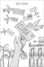
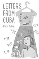
JOHN: For Letters from Cuba, the wonderful art direction team at Penguin Random House had the initial layout idea of the book cover already in place. I worked on this idea but also submitted additional sketch concepts in case that could be helpful and provide options. Even with the main concept decided, the art director and I went through different versions before arriving at its final draft. It’s a process and journey that I love and is a pleasure when working with such great people.
 RUTH: What materials did you use for the art?
JOHN: Many people think I paint on wood because of the texture seen in my paintings but I am actually working on illustration board. There is a process where I add different layers of color acrylic paint to a board. After about four layers, I sandpaper into it to give it a worn and old fashion look that I use for the background foundation. Once ready, I begin to transfer the sketch to the board through masking out shapes and painting various elements. As characters and scenes take shape, the final aspect is to add all the detail and shading to complete the art.
RUTH: Tell us about the research you did to conjure the setting. Have you ever been to Cuba? If not, were there other places that inspired how you imagined Cuba?
JOHN: Though I have not been to Cuba, I do my best homework and research to accurately portray the setting and its people. Other influences came from my wife Maria, who is a native of Puerto Rico. The two countries share a similar connection to environment, language, food, music, architecture, and history. Even their flags complement each other. Poet and political activist Lola Rodríguez de Tió passionately wrote, “Cuba and Puerto Rico are as two wings of the same bird. They receive flowers and bullets into the same heart …”
RUTH: I love how the ocean fills up half the page. It makes me think of the line in the book where Esther is on the ship going to Cuba and she’s scared as she hears the crashing waves that sound like the roar of a lion. She says, “I am crossing the ocean. But it feels as if the ocean is crossing me.” By any chance, did you have that line in your thoughts as you created the artwork?
 JOHN: It’s funny, I underlined that line in the book. Growing up near the ocean in Southern California I often looked out at that great expanse with a feeling of awe as well as acknowledging my own smallness. It is both beautiful and terrifying all at the same time, yet the waters convey a hopeful spirit towards the future and its possibilities. Esther’s journey feels like that to me.
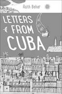
RUTH: The cover evokes three places that together form Esther’s map of the world – Poland in the top left, under gray clouds, which she is leaving behind; Havana, with the lighthouse and Capitolio in view and glimmering with color; and in the foreground, there is Agramonte, with fields and trees, the town in the countryside where Esther goes to live with her father and starts a new life. Can you tell us how you went about creating a convergence of these three places in your art?
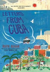 JOHN: I have a fascination with maps. I love being able to look over various geographic areas and imagine traveling through states and countries with byway lines of connections. Representing the many locations in the cover gives the viewer a sense of travel and moving from one place to another. Movement is what helps us grow, learn, and ultimately find our path and voice in life.
RUTH: We both share a Latinx background and I wondered about your thoughts on the immigration crisis and how that might have informed your art for Letters from Cuba.
JOHN: A few years ago, I was inspired to work on a family tree mapping its roots. On my father’s side I traced the family’s migration from Chihuahua, Mexico, to Texas, then on to California. On my mother’s side, I see her past relatives arriving from Slovakia to Pennsylvania, with some going though Ellis Island. Both families looked for a new start in a land of opportunity. This theme continues today. Immigrants often come to work and learn. Some because they need to flee from dire environments. Either way, they, and our own past families, have come to this country and contributed greatly to the success of our nation. It is this hope of possibilities that echoed in my mind as I worked on this project.
RUTH: You have illustrated many children’s books, and now you are also writing your own books. How does the flow between word and image come together for you?
JOHN: The book I am writing and illustrating is about a young boy who spends a day at work with his father, a landscape contractor. It is based off of my own experience working for my dad growing up and how it shaped me as an artist. I wrote the outline of the story first, but as a visual thinker and problem solver I had images already in my mind as to what some of the pages would look like. The result has been a mixture of both words and art happening simultaneously in a joy of shaping and balancing both sides of these creative forms.
RUTH: Thank you so much, John! And you, dear reader, hope you’ll check out the wide range of John’s beautiful artwork!
*
John Parra is an award-winning illustrator, best known for his art illustrated, Latino themed, children’s picture books. For his work he has received many awards and accolades including: The American Library Association’s Pura Belpré Honors, The Christopher’s Award, and The Golden Kite Award from The Society of Children’s Book Writers and Illustrators. Parra’s original artwork has also been showcased and displayed in numerous gallery shows and museum exhibitions throughout the United States and abroad with many paintings now residing in private collections. He has taught art at the Carnegie Art Museum in Oxnard, CA and regularly speaks as a visiting artist at schools and literary conferences across the country, advocating art and reading education. New picture books include The Power of Her Pen: The Story of Groundbreaking Journalist Ethel L. Payne (written by Lesa Cline-Ransome, S&S, Jan 2020), Little Libraries, Big Heroes (written by Miranda Paul, HMH) and One Is a Piñata: A Book of Numbers (written by Roseanne G. Thong, Chronicle). Visit John Parra in the studio, here. Visit John on the web johnparraart.com, or follow him on twitter @johnparraart
Trackbacks & Pingbacks
[…] It was a pleasure to be interview by the wonderful and talented author Ruth Behar about illustrating the cover of her new book: LETTERS FROM CUBA, coming out Aug 25. Attached are some initial sketches and ideas for book. Read all about the process HERE […]
Comments are closed.